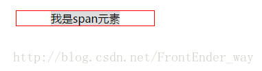
一、使用text-align: center;居中
对于行内元素或具有inline-block属性的元素居中,比如span、img等可以使用text-align: center;来实现。
1 2 3 4 5 6 7 8 9 10
| /*css*/ div{ border:1px solid red; text-align: center; width: 200px; } div span{ width: 100px; background: }
|
1 2 3 4
| <!--HTML--> <div> <span>我是span元素</span> </div>
|
!
1 2 3 4 5 6 7 8 9 10
| /*css*/ div{ border:1px solid red; text-align: center; width: 200px; } div img{ height: auto; background: }
|
1 2 3 4
| <!--HTML--> <div> <img src="a.jpg" alt="马超" width="100"> </div>
|
!
二、使用margin: auto;居中
使用margin: auto;来居中是平时布局里面最常用的了,但是和第一种方法不同的是这种css属性作用于本身元素,且必须给元素设定了宽度和具有display:block;的块级元素。
1 2 3 4 5 6 7 8 9 10 11
| /*css*/ div{ border:1px solid red; width: 200px; } div span{ width: 150px; background: margin:0 auto; display: block; }
|
1 2 3 4
| <!--HTML--> <div> <span>我是span元素</span> </div>
|
!
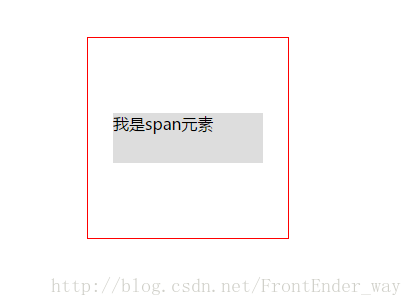
三、定位居中
这种方法好处是行内元素和块级元素都适用,但是需要知道元素本身的宽度
1 2 3 4 5 6 7 8 9 10 11 12 13 14 15
| /*css*/ div{ border:1px solid red; width: 200px; height: 200px; position: relative; } div span{ width: 150px; height: 50px; background: position: absolute; left: 25px; top:75px; }
|
1 2 3 4
| <!--HTML--> <div> <span>我是span元素</span> </div>
|
!
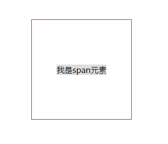
四、margin:auto;和定位的组合使用
这种方法好处是行内元素和块级元素都适用,但是需要知道元素本身的宽度。
1 2 3 4 5 6 7 8 9 10 11 12 13 14 15 16 17 18
| /*css*/ div{ border:1px solid red; width: 200px; height: 200px; position: relative; } div span{ width: 150px; height: 50px; background: position: absolute; margin:auto; left: 0; right: 0; top:0; bottom: 0; }
|
1 2 3 4
| <!--HTML--> <div> <span>我是span元素</span> </div>
|
!
五、负margin和定位的组合使用
1 2 3 4 5 6 7 8 9 10 11 12 13 14 15 16
| /*css*/ div{ border:1px solid red; width: 200px; height: 200px; position: relative; } div span{ width: 150px; height: 50px; background: position: absolute; left: 50%; top:50%; margin:-25px 0 0 -75px; }
|
1 2 3 4
| <!--HTML--> <div> <span>我是span元素</span> </div>
|
!
六、calc和定位的组合使用
calc是英文单词calculate(计算)的缩写,是css3的一个新增的功能,你可以使用calc()给元素的border、margin、pading、font-size和width等属性设置动态值。
calc使元素居中的原理和负margin是一样的,calc 允许你基于当前的页面布局计算尺寸。在上面的简单计算中, 50% 是容器元素的中心点,但是如果只设置50%会使图片的左上角对齐div的中心位置。 我们需要把图片向左和向上各移动图片宽高的一半。计算公式为:
top: calc(50% - (40% / 2));
left: calc(50% - (40% / 2));
1 2 3 4 5 6 7 8 9 10 11 12 13 14 15
| /*css*/ div{ border:1px solid red; width: 200px; height: 200px; position: relative; } div span{ width: 150px; height: 50px; background: position: absolute; top: calc(50% - (50px / 2)); left: calc(50% - (150px / 2)); }
|
1 2 3 4
| <!--HTML--> <div> <span>我是span元素</span> </div>
|
!
七、使用translate居中
这种方法实现原理和第五种是一样的,就是用css3的属性translate来达到和负margin一样的作用。translate是transform的一个值,在这里作用是定义2D转换。但是在IE9以下不支持。
1 2 3 4 5 6 7 8 9 10 11 12 13 14 15 16
| /*css*/ div{ border:1px solid red; width: 200px; height: 200px; position: relative; } div span{ width: 150px; height: 50px; background: position: absolute; left: 50%; top:50%; transform: translate(-50%, -50%); }
|
1 2 3 4
| <!--HTML--> <div> <span>我是span元素</span> </div>
|
!
八、使用flex居中
使用flex居中不需要知道元素本身宽高以及元素的属性。
1 2 3 4 5 6 7 8 9 10 11 12
| /*css*/ div{ border:1px solid red; width: 200px; height: 200px; display: flex; justify-content: center; align-items: center; } div span{ background: }
|
1 2 3 4
| <!--HTML--> <div> <span>我是span元素</span> </div>
|
!
九、使用table-cell居中
使用 display: table-cell, 而不是使用table标签; 可以实现水平居中和垂直居中,但是这种方法需要添加额外的元素作为外部容器。
1 2 3 4 5 6 7 8 9 10 11 12 13 14 15
| /*css*/ .center-aligned{ border:1px solid red; width: 200px; height: 200px; display: table; } .center-core{ display: table-cell; text-align: center; vertical-align: middle; } span{ background: }
|
1 2 3 4 5 6
| <!--HTML--> <div class="center-aligned"> <div class="center-core"> <span>我是span元素</span> </div> </div>
|
!